Chévere Pupuseria
SUMMARY
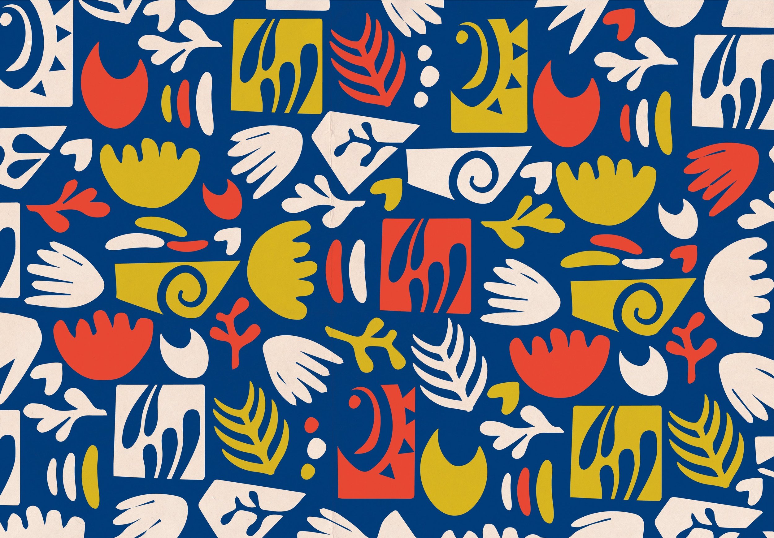
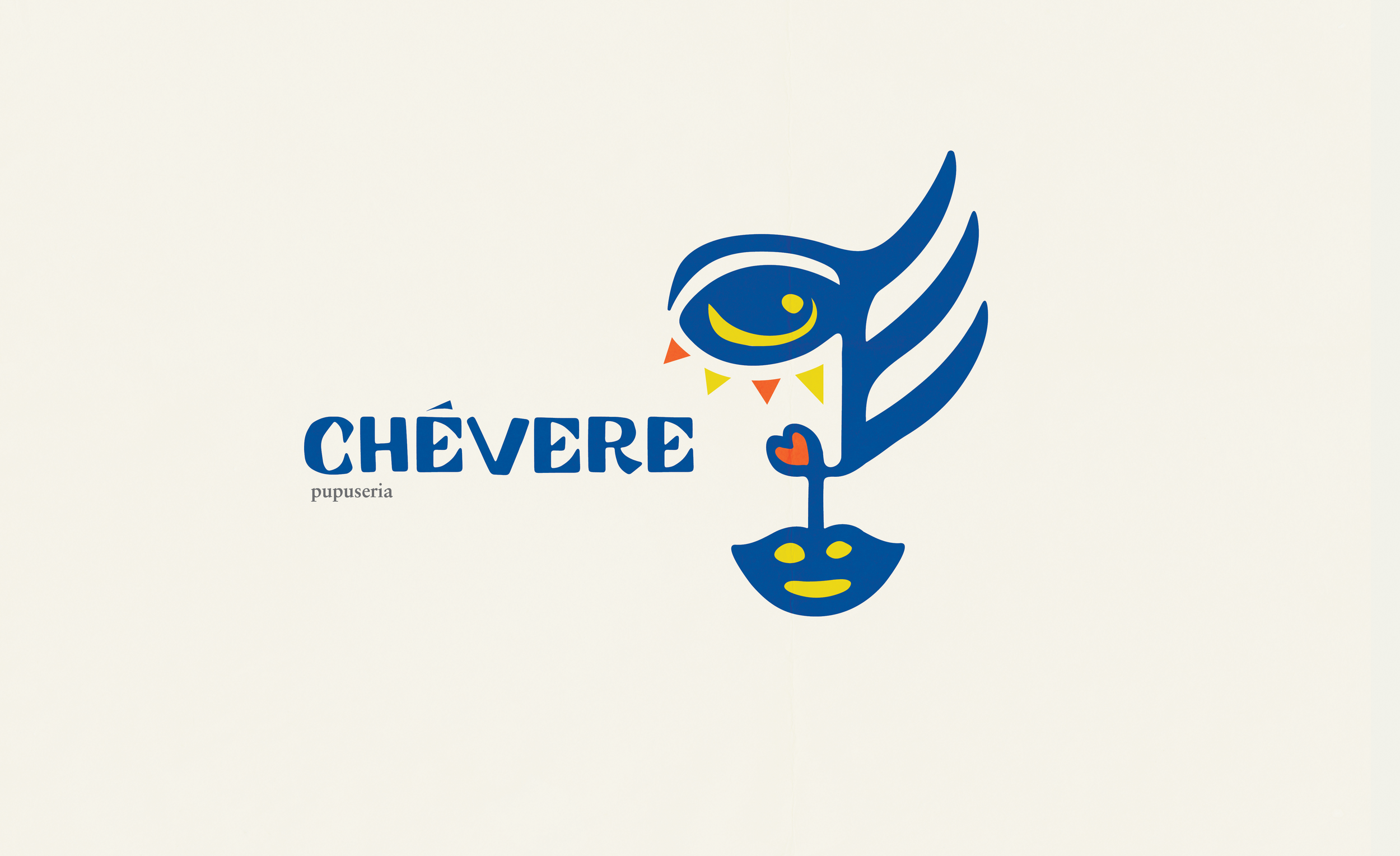
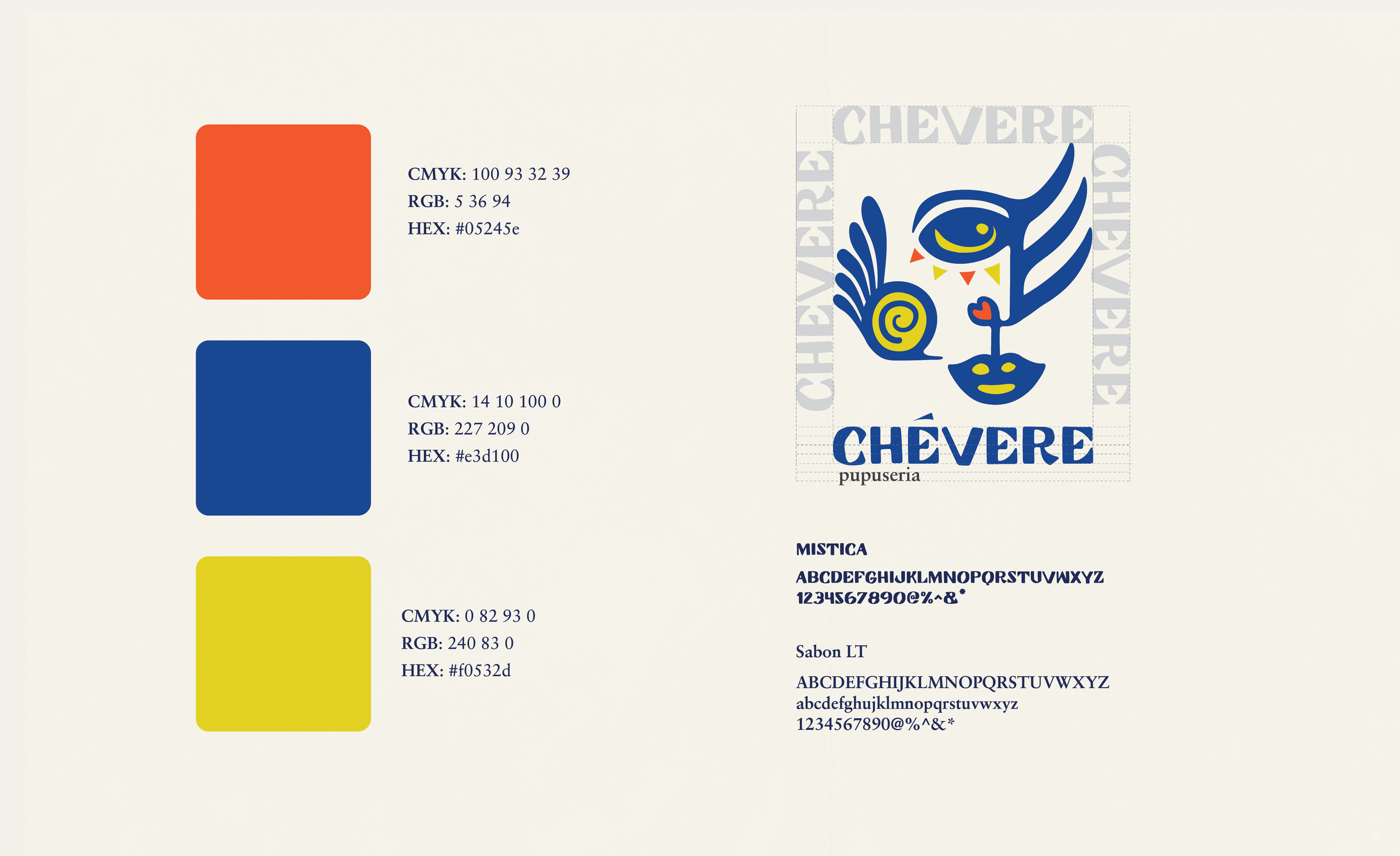
The reimagined brand revolves around a logo inspired by Emelda, the restaurant’s owner and only employee. The name of the restaurant, “Chévere,” is Spanish for “cool.” A single line connects the eyes, nose, and mouth, unified by a heart, emphasizing that this place is not just cool looking, but it’s also cool, good food, made with love. Further homage is paid to El Salvador’s through nuanced details such as the palm trees of El Salvador subtly represented on one side of the face, while the shadow in the eye mirrors a half-moon shape, a nod to the nickname “medialunas” for pupusas. The chin is made up of the circular shape of a pupusa, and resembles the bag the curtido is traditionally served in. The overall style represents El Salvador by taking a lot of inspiration from the country’s ancient Mayan drawings.
The objective of this project was to revamp the brand identity for Chévere, a Salvadorian restaurant nestled in Sacramento. It’s a small niche spot run by a single Salvadoran woman, Emelda. Chévere is known for its authentic Salvadorian cuisine, with a notable specialty of making delicious heart-shaped pupusas.
SOLUTION